Description
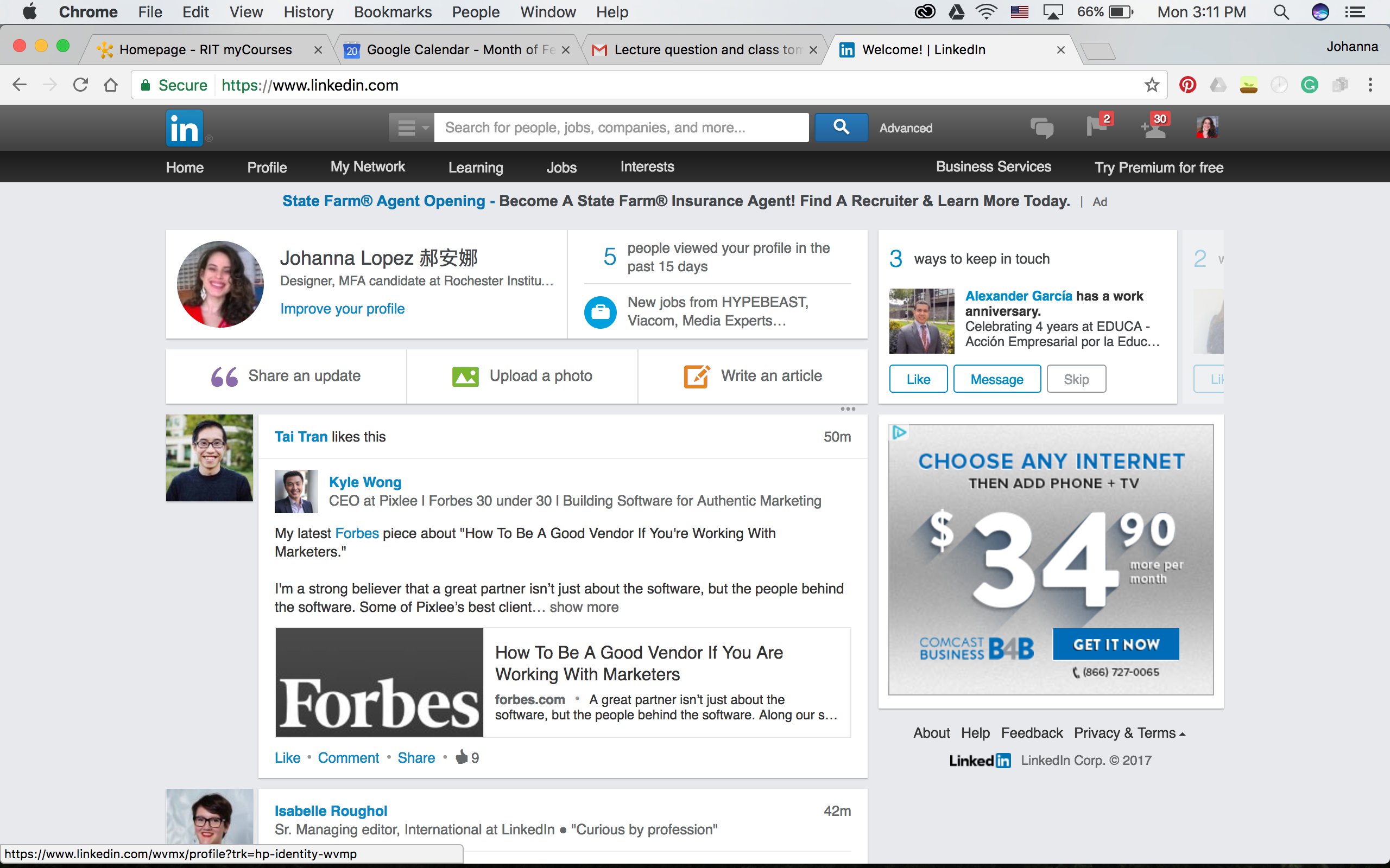
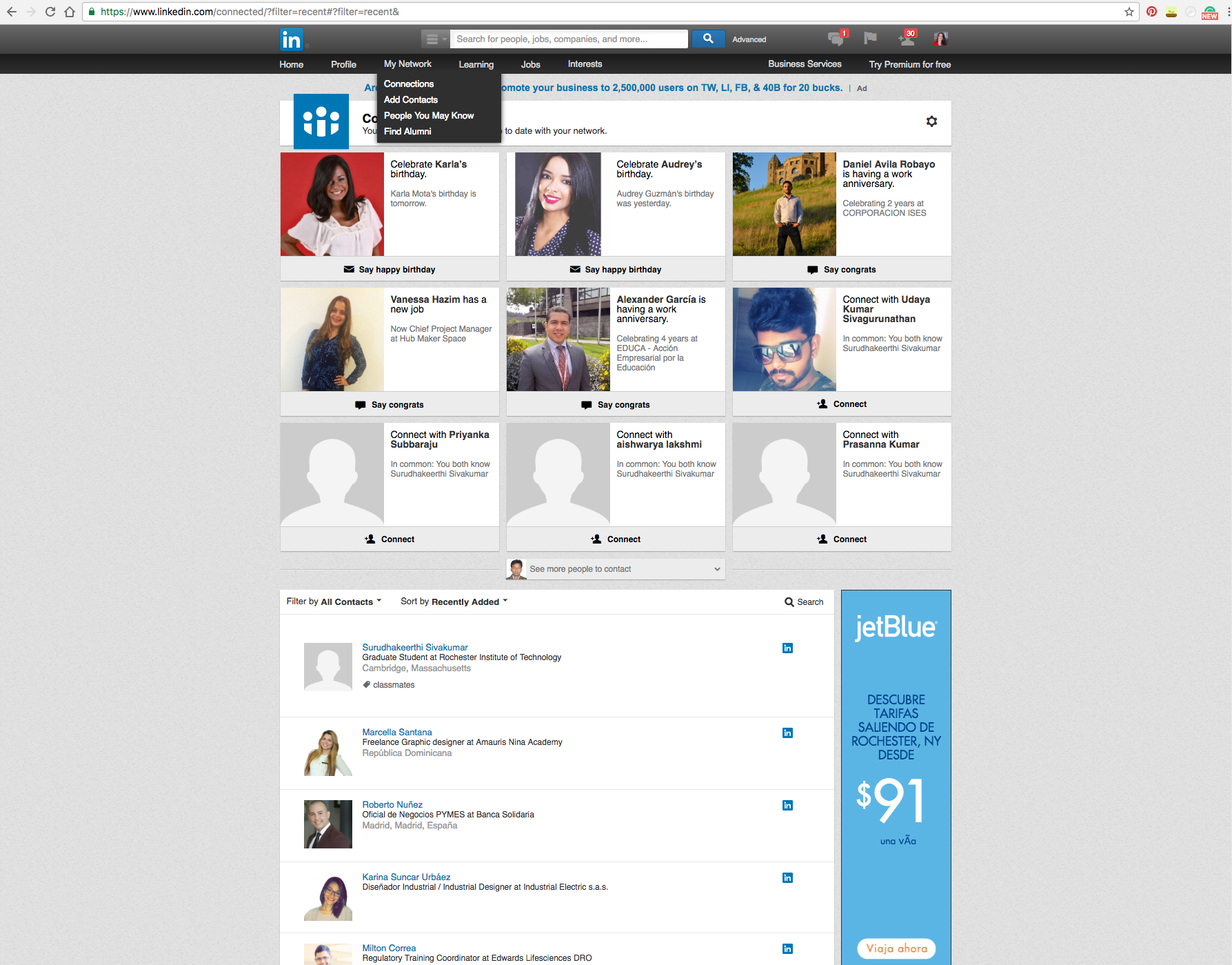
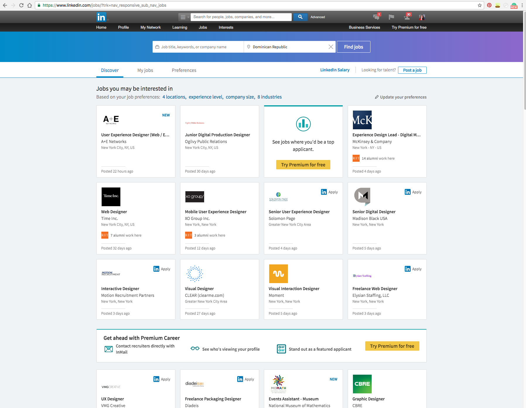
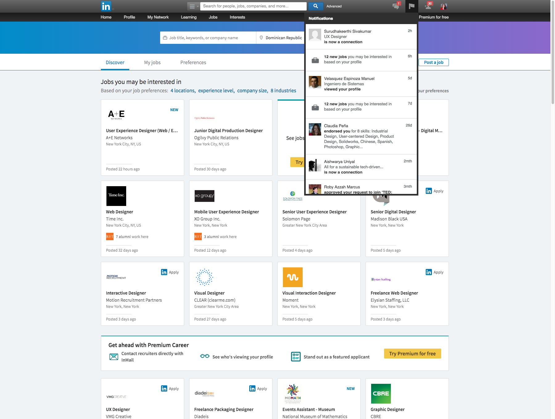
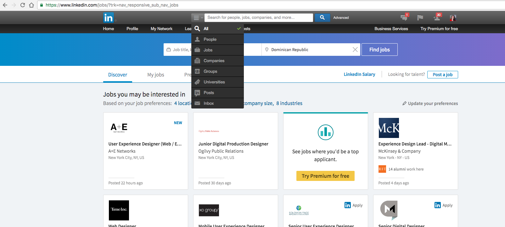
In February 2017, a new UI from linkedIn was launched, the UI was concentrated too much towards design where some of the most important aspects were some what neglected. We propose a design plan to find those drawbacks and work towards a better design.
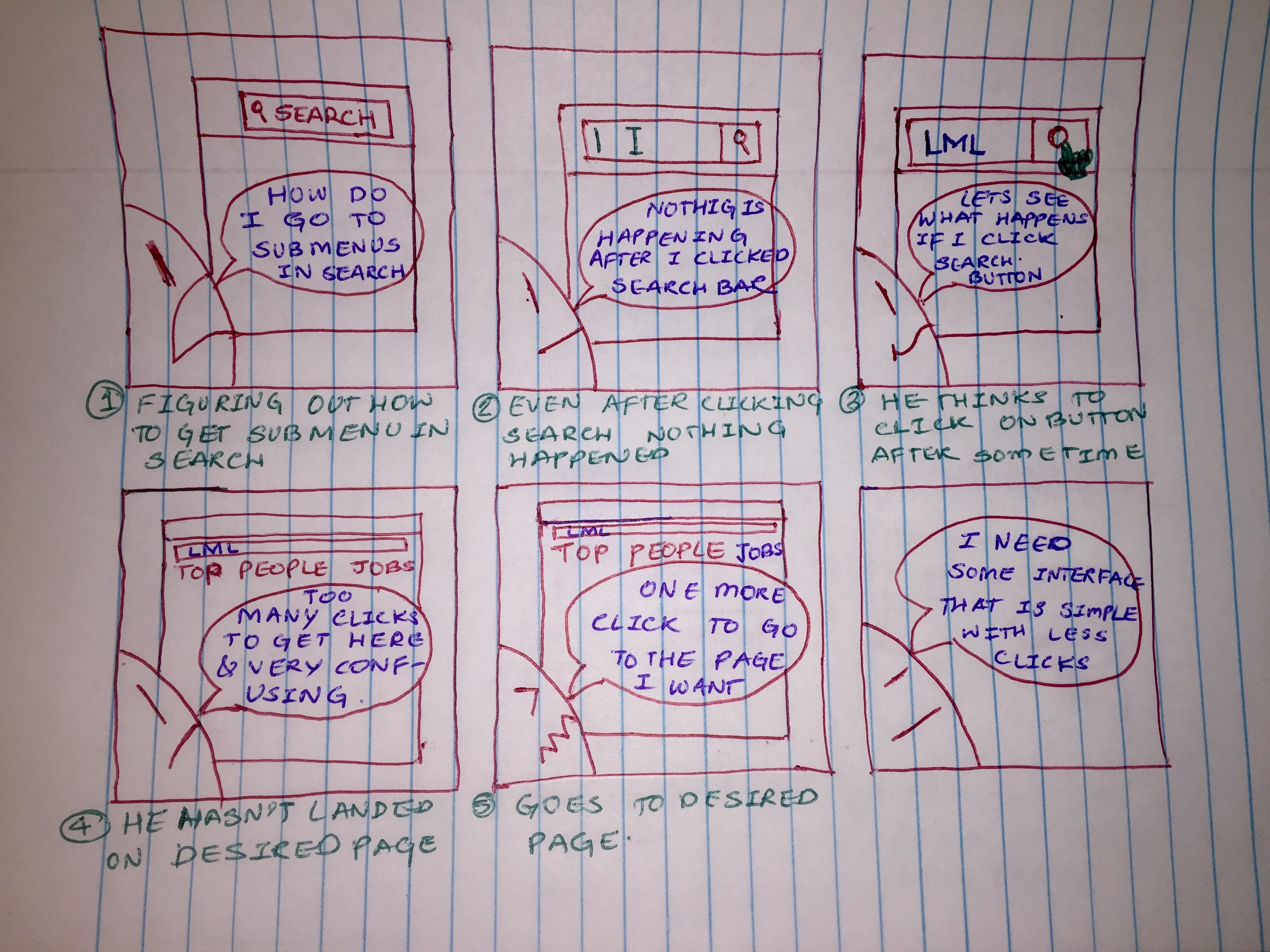
The existing problem
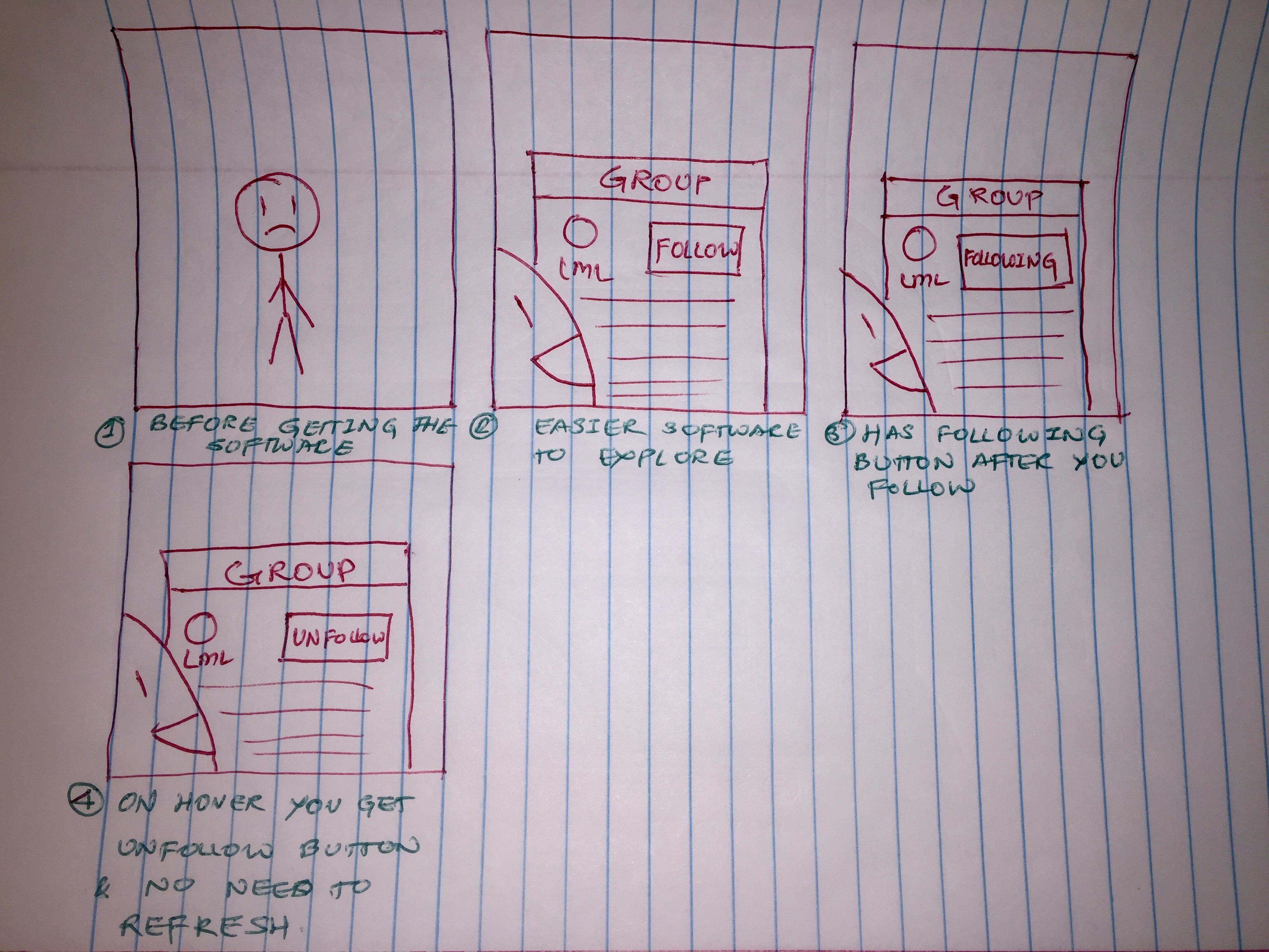
You all may have experienced the new User Interface which Linkedin has rolled out few days back. We have also observed that the new UI is not out for all the users there are few who still have the previous UI. So we wanted to grab this opportunity, this short transition time to collect user data and come up with new design which has good parts of both the versions. And not only that but also come up with something which both the UIs are missing. The basic idea behind this study is to evaluate the updated design on users and provide design suggestions for the platform. The task scenarios given to the users are based off of the most common tasks users (in this case students) perform on LinkedIn. The study hopes to provide required set of design changes that can further make the website more usable.
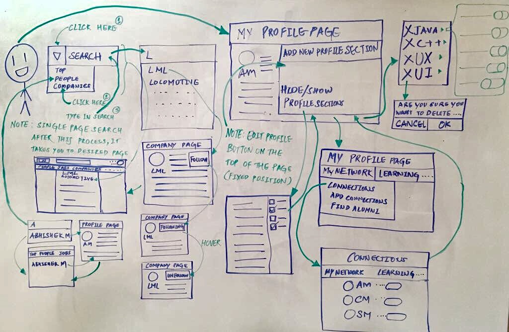
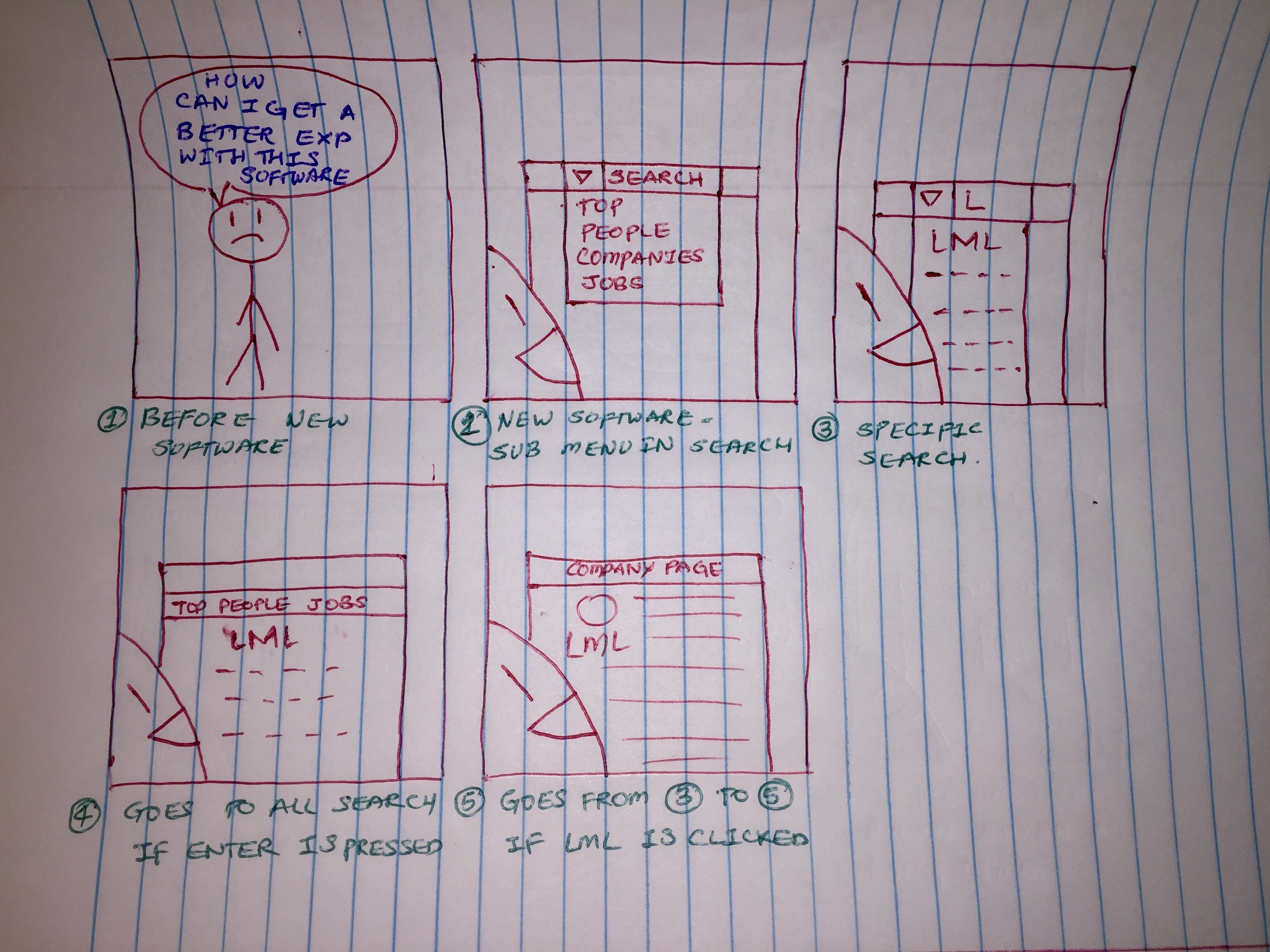
Direction for solutions
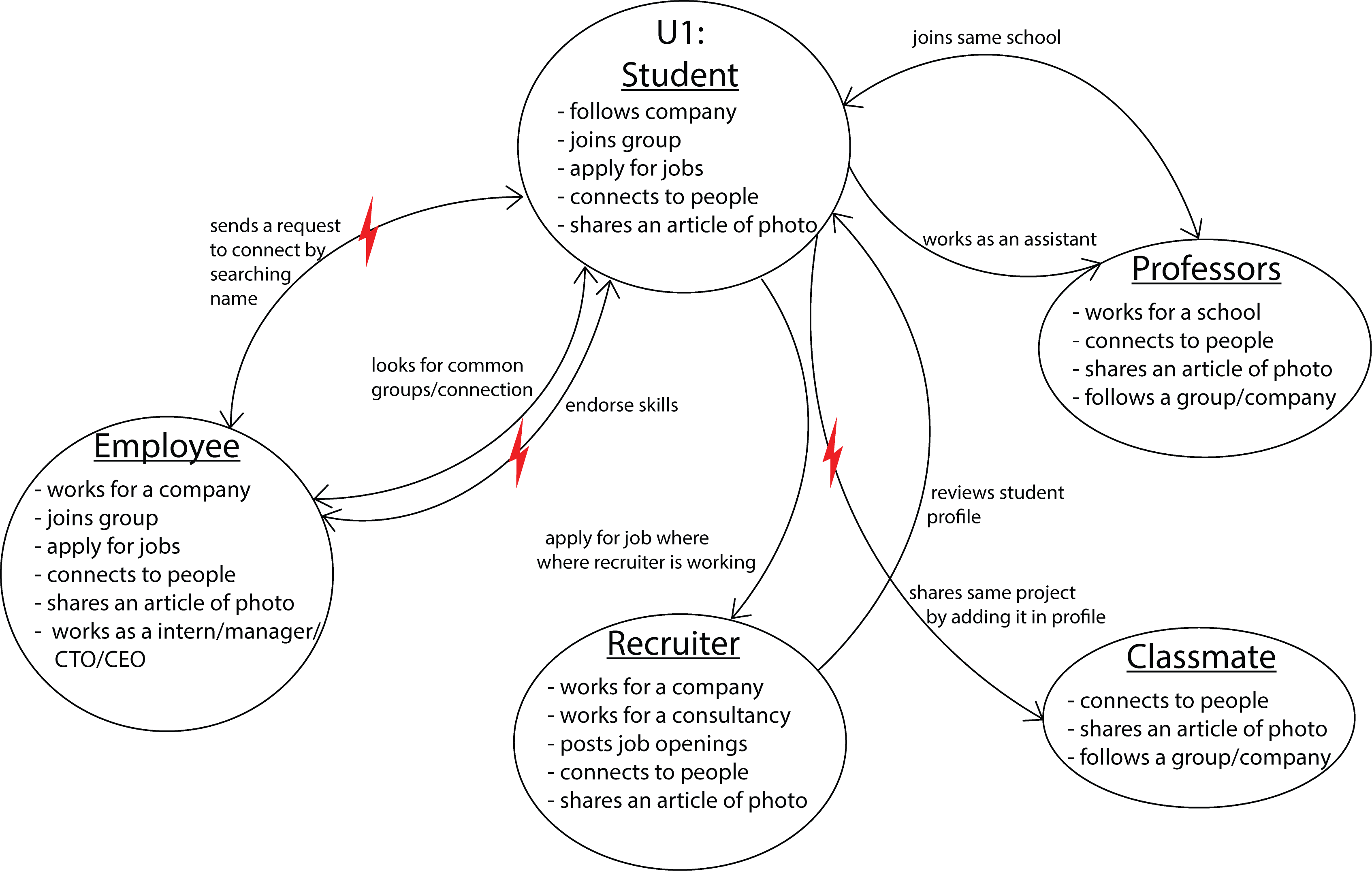
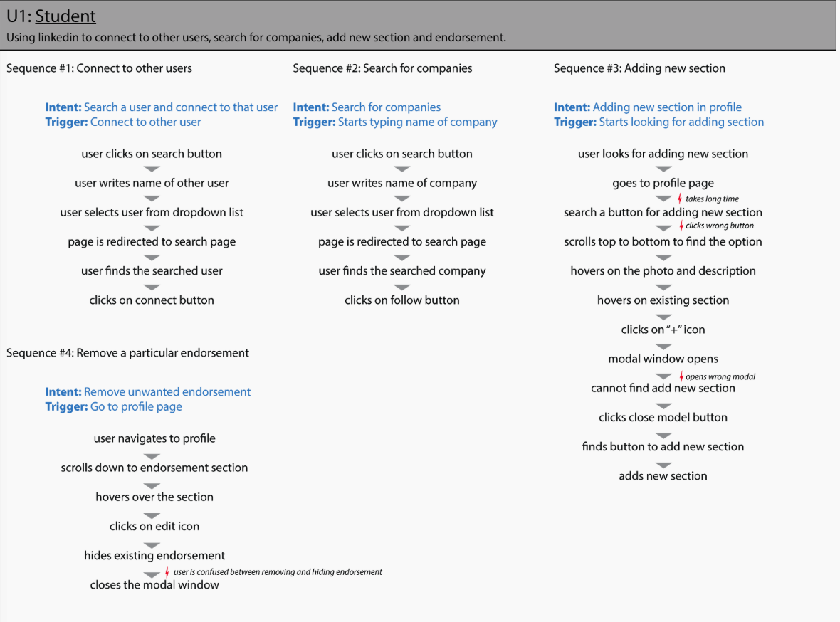
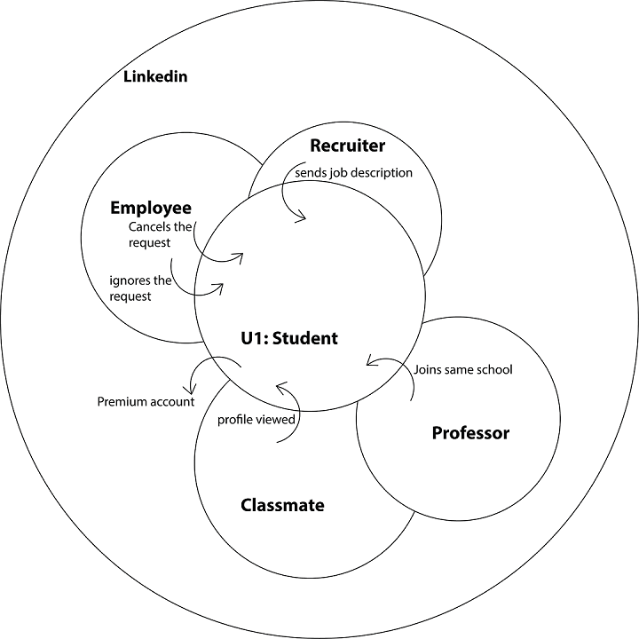
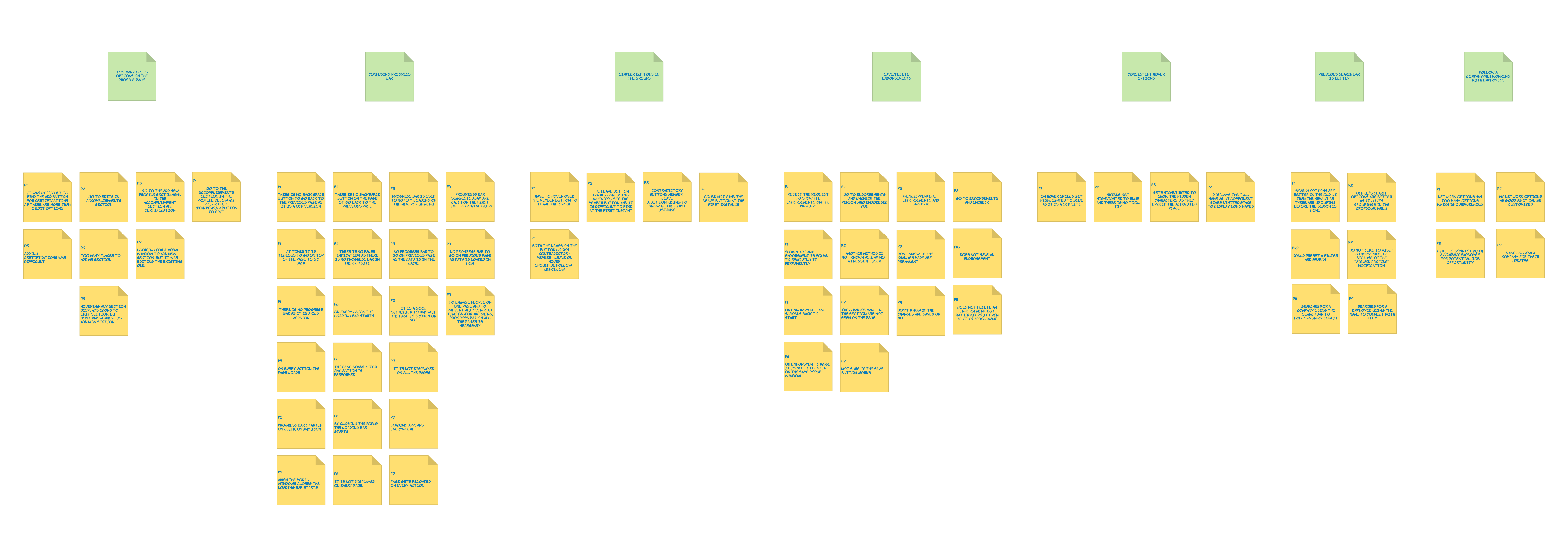
Interpretation of Data
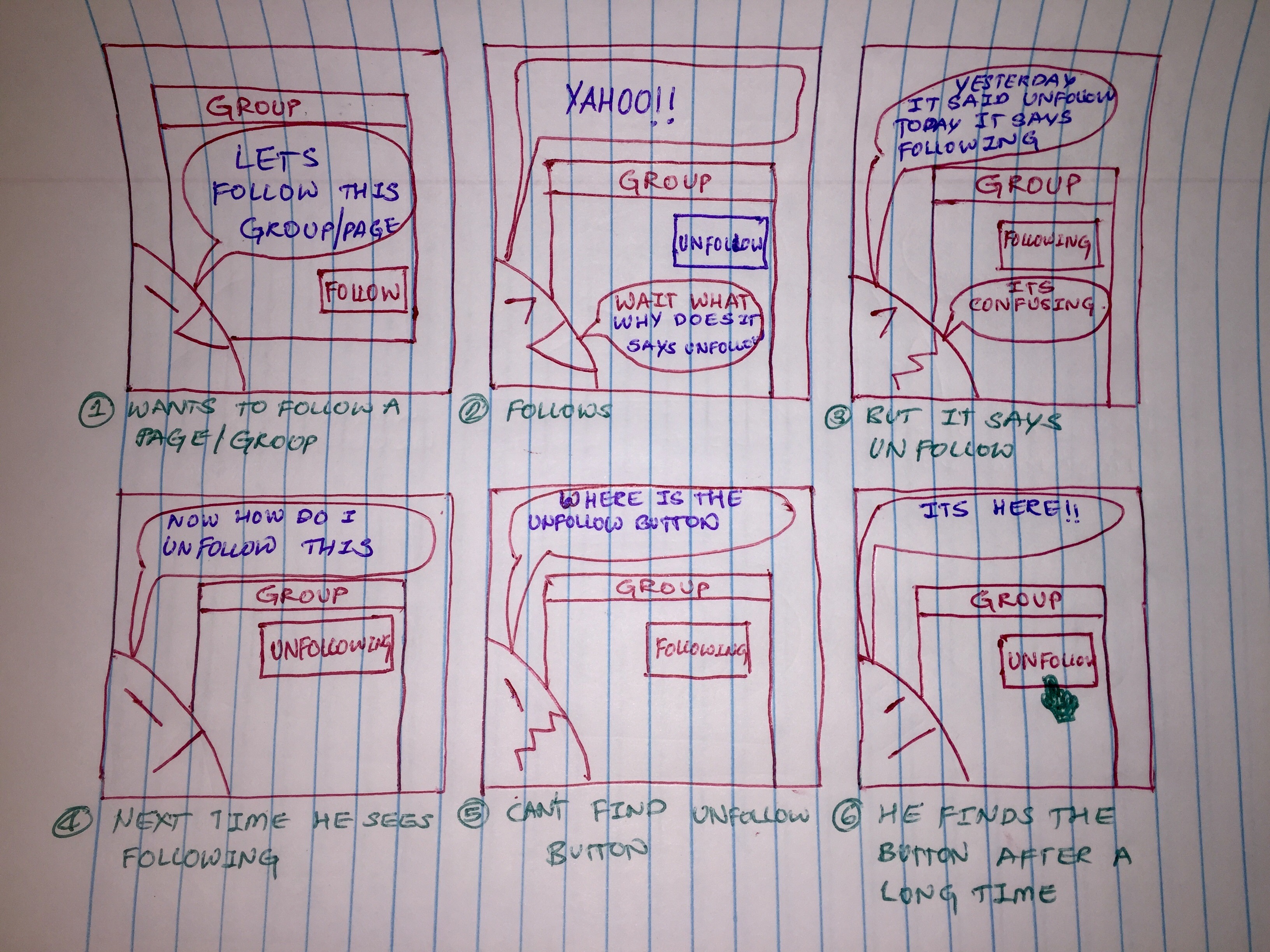
Following are the notes taken from the user interviews Uses Old UI 1. Irritated with new popups 2. Auto scroll of page after closing popup window 3. Thinks hiding endorsement = removing endorsement 4. Sees new UI for the first time 5. Wished to have photos of people who endorsed her 6. Endorsement section from old UI was better 7. Less options are visible 8. Search is confusing 9. Does not understand the meaning of follow button 10. Not sure how to unfollow company 11. Cannot differentiate between headings and buttons 12. Difficulty in adding new section
